This case study explores the nature and life cycle of a design system, with the hopes of understanding how to decrease entropy when building a successful design system
BACKGROUND
In 2017, my journey with Superbalist began as a product designer. At that time, the company was on the cusp of significant growth, and its design system was in its formative stages, lacking both consistency and scalability.
PROBLEM
If I were to reflect on the past six years and consider all the challenges, the most significant one by far was the effort to decelerate the entropy of the design system.
The absence of a well-maintained structure, combined with rapid growth, posed major hurdles.
As our team scaled, inefficiencies in the design system and ways of working led to design and engineering debt, the shipping of one-off solutions, and knowledge silos.
The other significant issue was the lack of effective communication between Product and Brand, Editorial, Marketing, and Retail teams.
These teams were often out of sync, operating independently, and this discord hampered the design system's overall efficiency.
To mitigate these risks, we must prioritise a centralised workflow and a seamless experience across the product portfolio in the form of an efficient design system.
RESPONSIBITY
Over six years, my role evolved from holistic product design to specialised design system ideation and management. This transition aimed to address user experience disparities and alleviate design and engineering debt.
During this period, I led projects such as Android and iOS app redesigns, a Checkout Experience overhaul, and the 'Continuum' Personalisation Research initiative. These initiatives contributed to shaping Superbalist's visual language, enhancing the user experience, and setting new e-commerce standards.
As a fervent design system advocate, I fostered cross-functional collaboration to ensure a seamless user experience.

approach
RESEARCH
To gain a deeper understanding of the challenges within our product, I conducted research at multiple levels. This involved a thorough exploration of the evolution of Design Systems in the contemporary landscape, including methodologies such as Atomic Design by Brad Frost, BEM and Tailwind CSS.
Additionally, I closely tracked the progress of other relevant systems, such as Google's Material Design and Apple's Human Interface Guidelines.
I spent a substantial amount of time analysing other e-commerce patterns. They all share a few certainties, so learning from others is key. I also performed comprehensive analyses of both our direct and indirect competitors, which provided valuable insights on areas for improvement and potential pitfalls to avoid.
It's crucial to recognise that best practices can sometimes become worst practices, underscoring the need for caution when adopting design patterns, and for thorough research into their effectiveness.
Furthermore, I made a concerted effort to stay well-informed about the tools we utilised, specifically Sketch, Abstract, Jira, and later Figma. Remaining up-to-date with these tools is of paramount importance in our fast-paced industry, as it significantly impacts the system's overall stability and performance.
Then, I also conducted interviews with people from different departments (UI/UX
Designers, Brand and Marketing Marketing Managers, Front end developers, Product Managers, Engineering Managers…).
After these initial interviews, we discovered that we need to: Identify all the design issues in our product. Learn the common standard and principles of a successful design system.
This research shed light on all the design issues in our product and the common standard principles of a successful design system.
Seed
Discovery
Framing
Solutions
Continuum
Design systems can be broken down into four concentric layers.
Foundations
Defines brand style guidelines, capturing its essence digitally
Tokens
Codifies design concepts for cross-platform consistency.
Core Systems
Solves interface challenges with reusable systems.
Components
Offers reusable interface parts for efficiency.
Audit: Visual Analysis
I initiated the process with an audit of our product across various platforms. This involved cataloguing all instances of specific components like buttons, drop-downs, input fields, on different pages and flows. Following this, I exported all the assets from the design system and organised them side by side, enabling us to conduct a thorough examination.
What became apparent was a beautifully chaotic assortment of inconsistencies. Strangely, these inconsistencies were so widespread that they created the illusion of uniformity. Among the issues identified, let's explore two of them. The first issue centred on colour.
Managing the existing colour system posed a unique challenge, given that the brand's primary colour was green. However, for some inexplicable reason, a prior iteration of the system featured big red and white buttons on all major call-to-action elements, adopting a 'robot UX pattern' that had become quite perplexing.
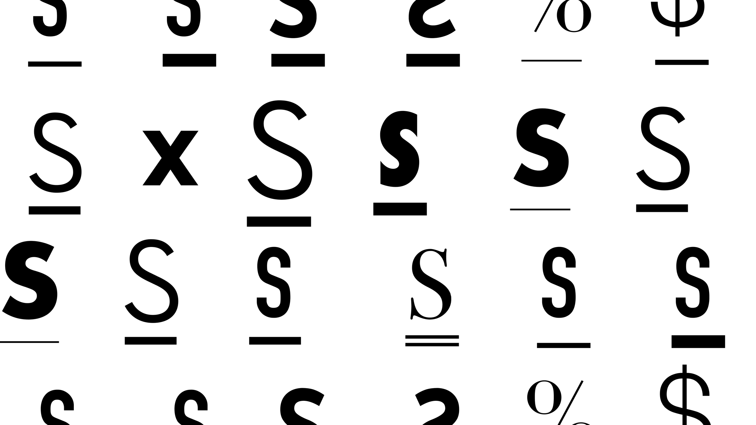
The colour palette seemed somewhat impractical. So, how did we find ourselves in this situation? The straightforward answer lies in the absence of a functional design system. The second significant flaw related to typography, with the use of numerous fonts and an extensive range of styles, spanning almost every conceivable size, effectively eradicating any potential for a harmonious rhythm.
Multiple Component Files | Split the library into smaller, related groups of components
design evolution
design evolution
Core Princples [ Gestalt ]
A remarkable pattern is the axiom of brilliance at the core of every great brand. A visual language serves as the embodiment of a brand and its core essence. It's within this notion that the principles of Gestalt, developed by German psychologists in the 1920s, take centre stage.
Gestalt, meaning "form" or "shape" in German, is built on the theory that "an organised whole is perceived as greater than the sum of its parts." These principles became the guiding light to distinguish the foundations: space, colour, iconography, and typography. The application of Gestalt principles allowed us to create a design system that formed a harmonious and unified whole, ensuring that every design element worked in synergy.
A remarkable pattern is the axiom of brilliance at the core of every great brand. A visual language serves as the embodiment of a brand and its core essence.

Brand Identity
A key element of our brand identity lies in the visual representation of our name. The wordmark, our very name in a distinct and unique font, serves as a visual anchor. During the Stitch iteration of our design system, we revisited this core element of our brand identity.
We aimed to enhance the brand's essence and visual impact. It's in this process that the wordmark was meticulously redesigned to harmonise with the new visual language we were crafting. The goal was not just to create a logo but a symbol of our identity, instantly recognizable and synonymous with Superbalist. The redesign breathed new life into our brand's core essence.
IS BIGGER BETTER, PERHAPS AFTER NUMEROUS CASSE STUDIES AND PERSONAL DISSATISFACTION. I’VE BEEN STUDYING THESE PATTERNS FOR MORE THAN 1095 days.
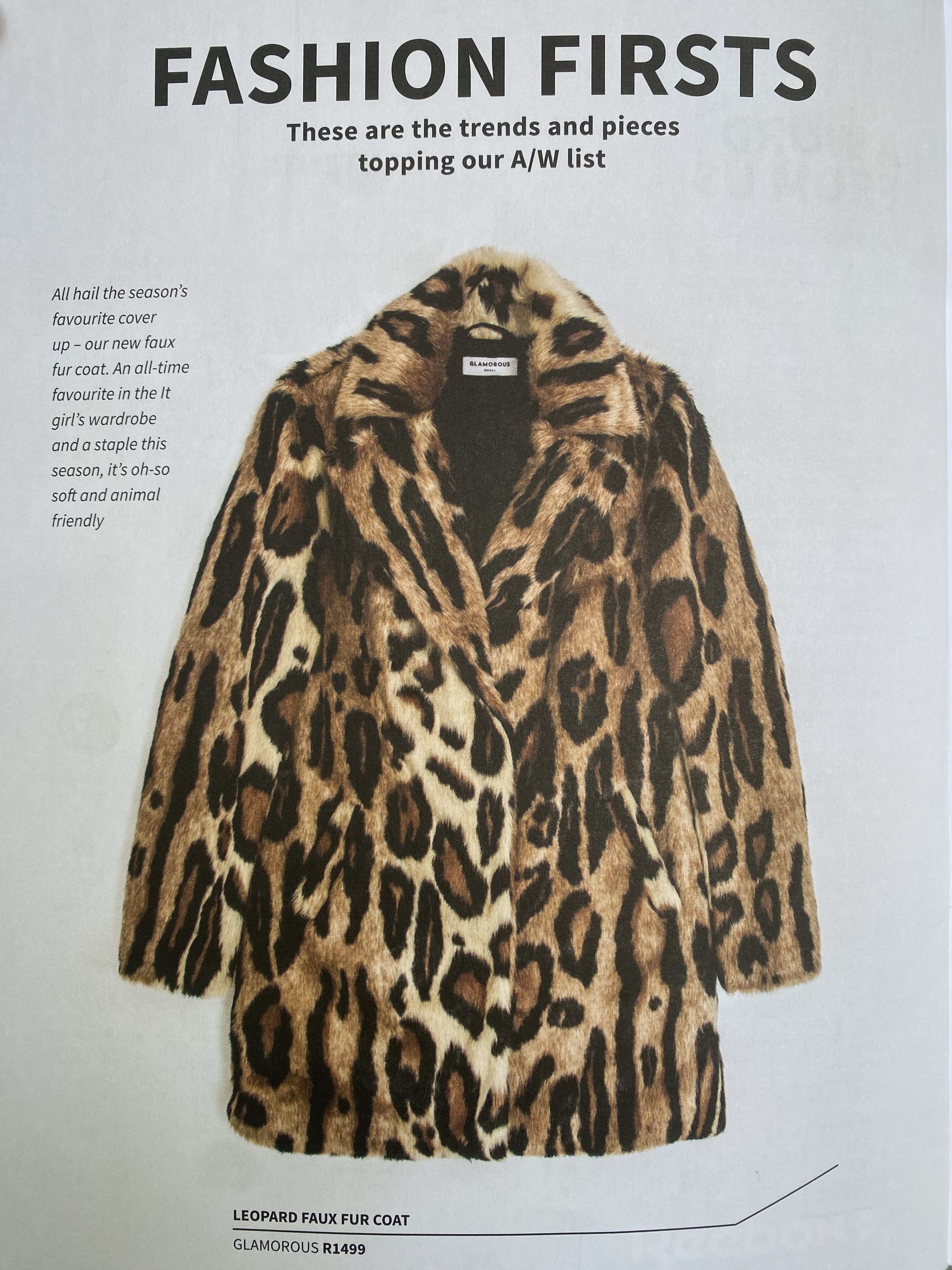
Best practices are lessons learned but fuck sakes lets be a fashion brand. Lets be bold and clear. we are too wishy washy.
There is too many of everything. Too many text styles. Too many patterns all conflicting with one another because there is no order. A new pattern is designed to create rhythm, style in our store. This is our store

GRIDS & SPACE
Grids & Space
The thoughtful application of grids and space is like composing a symphony. It's the structure that provides a rhythm and harmony to our product's visual experience. In the Stitch iteration, we introduced a refined grid system, a set of guidelines that govern how content is organised and presented. This brought order to the chaos that once plagued our design system.
COLOUR
Colour is more than a visual treat; it's a language. In Stitch, we embarked on a journey to declutter the colour palette. We recognized the need to establish a unified and functional colour system.
The goal was to simplify the interface, moving towards a more monochromatic base design and reducing the use of too many colours. By doing so, we allowed our fashion products to take center stage in a cleaner and more elegant presentation.
To facilitate this transition, I introduced three distinct colour palettes—a primary and secondary palette and an extended tertiary palette. The primary and secondary palette served as the foundation for our interface, while the tertiary palette was intended for marketing and editorial content creation.
This approach was documented within our comprehensive design system, ensuring accessibility and thorough testing of our colour choices.
Stitch DS | Primary palette [ UI ] Users — Product, & UI/UX
Stitch DS | Extended colour palette [ PRODUCT CONTENT ] Users — Product, Marketing, Editorial and Brand
typography
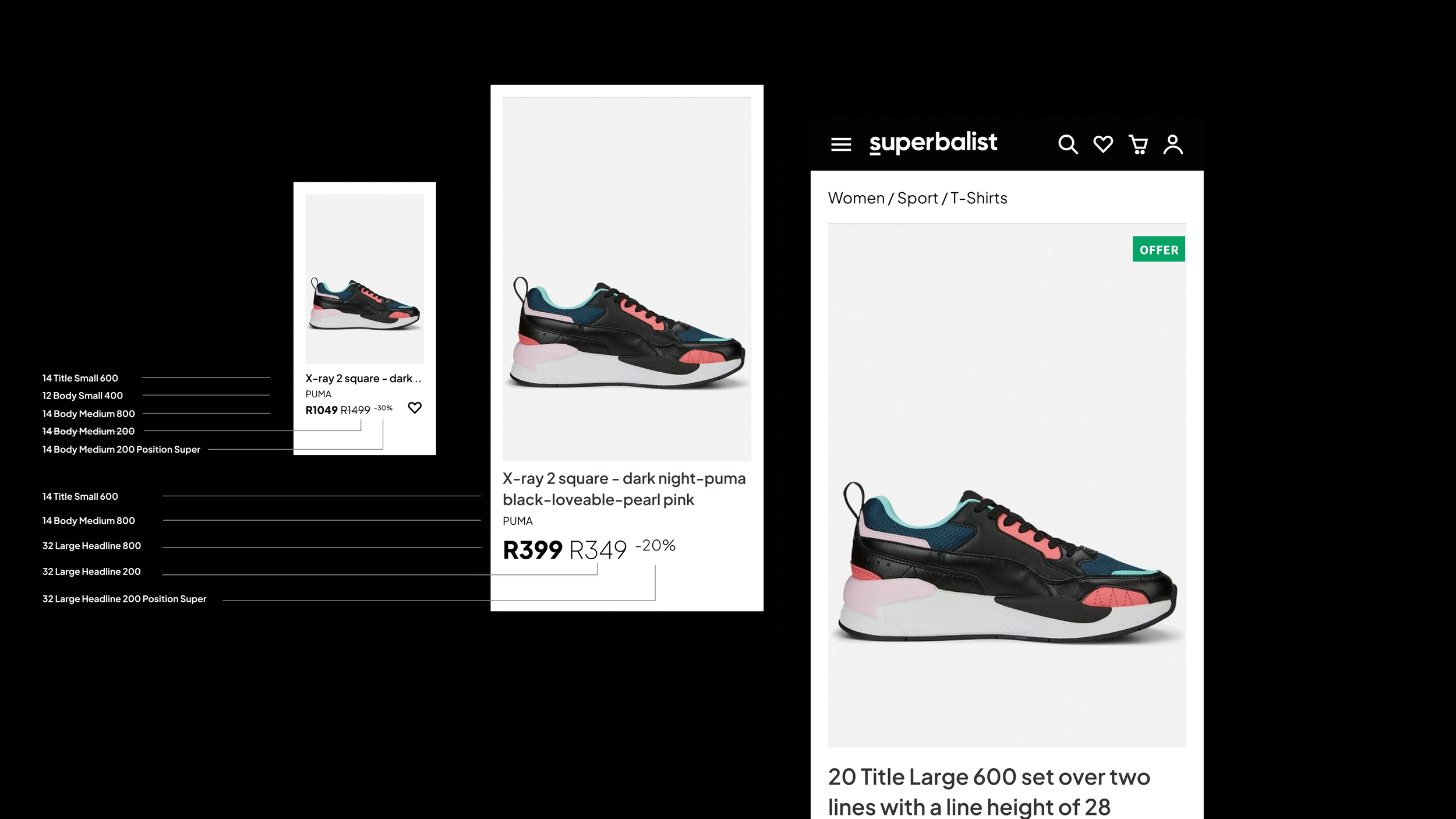
Typography is the voice of our brand, and it should speak with clarity and consistency. In Stitch, we streamlined our typography, introducing a well-defined set of typefaces and styles. This ensured that our content maintained a harmonious rhythm, and users could engage with our brand with clarity and ease.
iconography
Icons are the visual cues that guide our users. In the Stitch iteration, we embarked on a mission to refine our iconography. Our design team created a cohesive set of icons that adhered to a single style, ensuring that each icon conveyed its purpose with clarity. No longer were users bewildered by a hodgepodge of conflicting icon styles. The new icons spoke a language of their own, a universal language understood by our users.
MVP— RESULTS
The impact of our efforts was not just visible; it was measurable. After implementing the design system and fostering collaboration, we witnessed a significant reduction in design and engineering debt.
The product development process became streamlined, enabling faster iterations and smoother workflows. User feedback overwhelmingly supported the changes. We noticed a significant drop in user-reported issues related to inconsistency and design flaws. User satisfaction scores also climbed, as users enjoyed a more coherent and visually appealing product.
Key performance indicators, including conversion rates and user engagement, exhibited positive trends. The design system played a pivotal role in enhancing the overall user experience, translating into tangible business results.

lessons learned
Throughout this journey, we gained invaluable insights into the world of design systems and cross-functional collaboration. One of the most crucial takeaways was the importance of advocating for design systems within an organisation. Being a vocal advocate ensures that design systems receive the focus and support they need.
Furthermore, we realised that successful design systems thrive on consistent communication. Open channels of communication between different teams are essential to create a shared understanding and maintain alignment. Centralization of resources and knowledge through a comprehensive design system is a strategic move, significantly benefiting long-term product development.


